

In this blog post series I’m showing you what you can do to give your website a health check.
In the first post I showed you how running a robust competitor analysis of websites in and outside your industry can help you benchmark how well your site is doing against others in its field.
Then in the second post I showed you how to run an SEO audit on your website, so you can make sure it’s doing the best job of attracting high quality visitors.
In this third post I’m going to be showing you the third element to investigate – how good your site is at converting your visitors to sales.
Get the free guide:
9 common website conversion killers – and how to fix them
Download it here.
Why you need to focus on conversions
It’s all very well having lots of highly targeted visitors coming to your website, but if they don’t know what to do when they’re there, you’re more than likely going to lose them before converting them into customers.
Companies have historically focused most of their attention on the acquisition side of things – that is, attracting visitors to their website – and have tended to treat the on-site activities as an afterthought.
A simple truth is that acquiring new visitors generally costs you money, while converting them into customers doesn’t have to cost you anything.
It’s possible to increase your website’s conversion rates, and by extension your revenue, without incurring any costs.
And more revenue at the same costs means greater profitability.
In fact, a relatively modest conversion rate increase of 50% can result in an increase in profitability of around ten times that amount – because cost of sale isn’t affected.
This is why it’s so crucial that you pay attention to your visitors’ on-site experience, and try to make their conversion journey as seamless as possible.
In this blog post I’m going to be looking at the different areas of a website (homepage; blog; landing page; checkout process) and how you can make sure each one is optimised for conversions on your website.
Start with your analytics!
It’s a good idea to go to your analytics programme before you do anything else. This will show you any areas on your website that are posing problems for your visitors.
I’m a firm believer in basing all design decisions on data insights – otherwise you’re just acting on a hunch rather than scientific evidence. So it’s crucial that you get quantitative insights.
I will show you a Google Analytics report for each section of the website that I run through with you. If you have a different analytics program on your site there will almost certainly be equivalent reports that you can analyse.
Area 1 – the homepage
The homepage is the page that gets the most visits on average. It’s the shop window to your brand, and it’s usually the first point of contact for a visitor to your site.
For this reason I’m going to start with this page.
To get an initial overview of how your homepage is performing, go to Google Analytics and navigate to:
Behavior > Site Content > All Pages
This is the pages report, and it’s useful for getting a top-level view of how each of your pages is performing.
By default it is ordered by volume of page views, so your homepage should appear somewhere near the top:
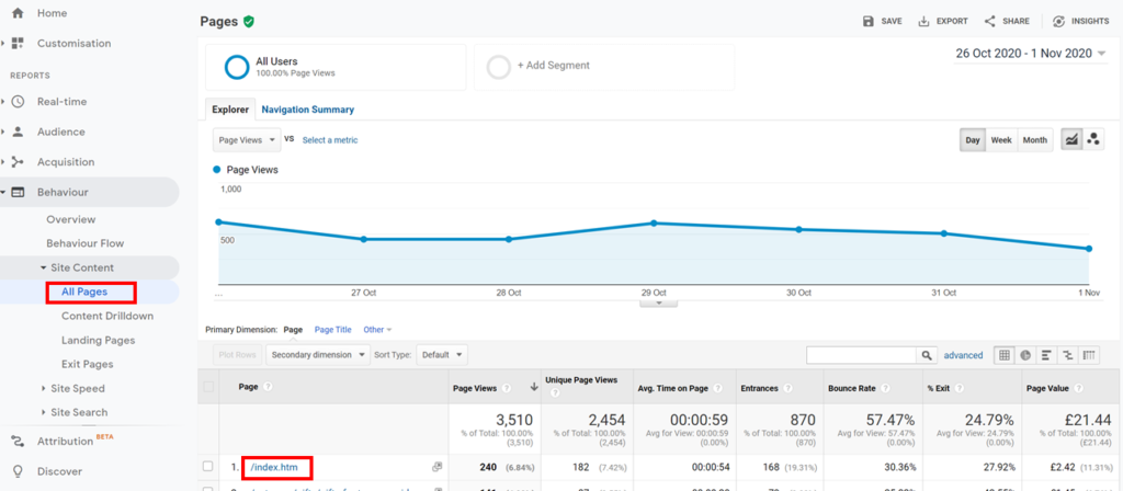
You can then look at metrics like average time on page, bounce rate and exit rate.
This should highlight any major issues that you can then address.
You can also look at how the page fares for these metrics in comparison with the other pages on your site.
Click on the Comparison button, and then select the metric you want to view from the dropdown:
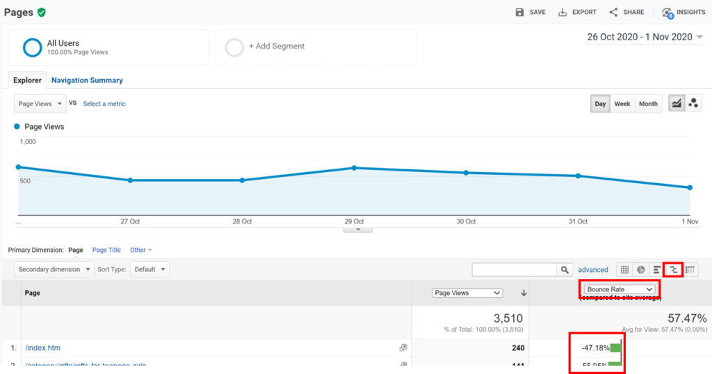
The green and red bars show whether the page is performing better than (green) or worse than (red) the site average. In this instance the homepage bounce rate is 47% better than the overall website average.
Areas to focus on
Not all homepages are the same – but there are elements that most homepages share, like
- The headline
- An email capture form
- Links to key sections of the website
- Social proof/testimonials
You need to make sure that you have all of these things on your homepage, and that they are doing as good a job for you as they possibly can.
Let’s look at each of them in turn.
The headline
Your homepage headline is one of the most important elements on your website. This is because it provides a golden opportunity to show visitors what it is that you do, and how you can help them.
If it piques their interest and hooks them in, it can make the difference between whether they stay on your site or click off to a competitor.
So it needs to be both succinct and compelling.
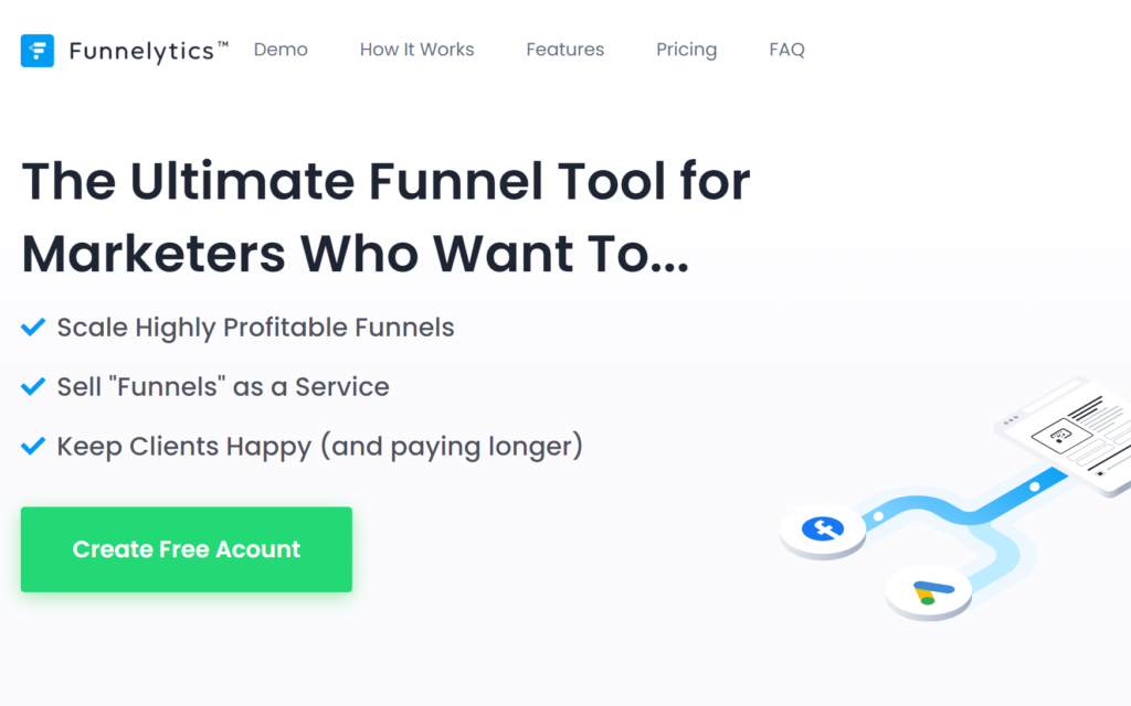
This one by Funnelytics is great, as it states very clearly what the tool is that they’re selling, and what’s in it for you if you create an account with them.
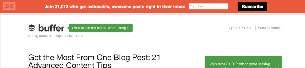
This one… less so.

It doesn’t tell you anything about who they are, or why you should use them.
They are missing an opportunity to tell you how they are different from the competition.
Try split testing different headlines on your homepage to gauge which ones are the most compelling.
An email capture form
If you aren’t using a form on your site – or at very least just on your homepage – to capture visitors’ email addresses, then you should start doing so straight away.
As I mentioned in the first post in this series, some of the most successful business owners in the world say that their email list is their most valuable asset.
There’s a simple reason for this.
Email consistently outperforms other channels in terms of conversions.
And, as opposed to your audiences on Facebook or Twitter, you own the list. It can also drive consistent volumes of traffic to your website.
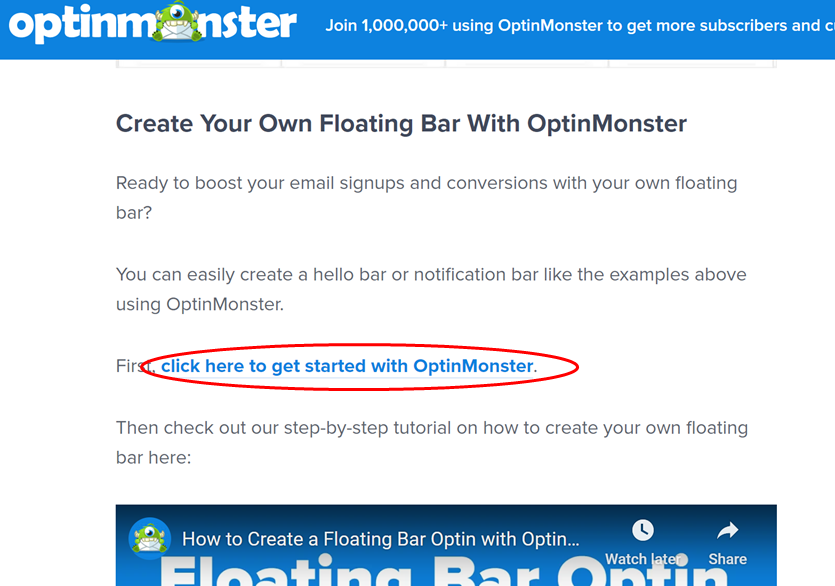
If you don’t already have an email capture form, the good news is that you can use free tools like Hello Bar or Sendpulse.
Hello Bar sits at the top of your page, so it is always visible but isn’t too distracting.
You also want to make sure you’re providing something valuable in exchange for someone’s email address.
We get too much email these days. So you’ll need to have something that allows you to cut through the noise and entices them to sign up.
A free eBook or guide can work really well for this.
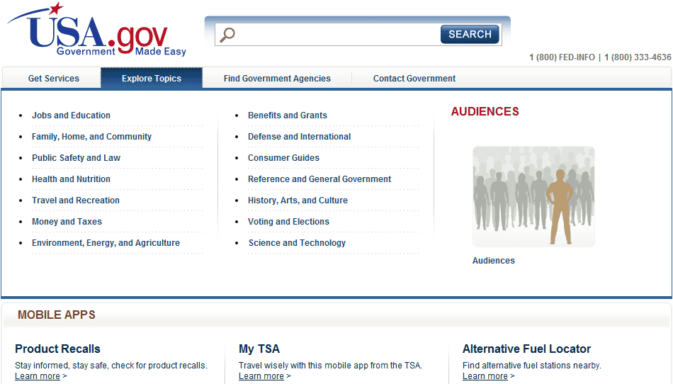
Links to key sections
One of the jobs of the homepage is to guide visitors through to other areas of interest on the website. So you need to check that there is very clear ‘signposting’.
The page navigation should be clear, simple and logical. If the site uses mega-nav menus, make sure they’re not too long or take up too much space.
Steer away from this type of thing:
Aviva links off to deeper content in a very structured way. It’s really clear where you’re being taken to, and it is in line with the site’s content and product hierarchy:
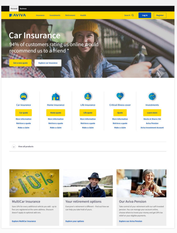
Check that your homepage lets visitors easily find where they need to go, and try to keep it as simple as you can. If your site navigation is overloaded, try stripping out irrelevant or duplicated links.
Get the free guide:
9 common website conversion killers – and how to fix them
Download it here.
Area 2 – the blog
The next area to spend some time looking at is your blog.
A blog is a vehicle for attracting a rich source of targeted traffic to your site.
But it can also be a good way of converting visitors to customers – as long as you follow a tried and tested formula.
1. Link out to other websites
Including links within your blog posts to other websites is a good idea for a number of reasons.
As Rand Fishkin of Moz testifies, it can elicit inbound links from the site you’re linking to, as well as validating the credibility of your content.
Whilst it may seem counterproductive from a conversion perspective to send visitors away from your site, the benefits generally outweigh this risk.
2. Link out to your other blog posts
By providing links to your other blog posts from a specific post, you are:
- giving your visitors more of an opportunity to spend more time on your site
- making it easier for search engines to crawl your website
- and (hopefully!) enriching the user experience by giving the reader access to more detailed, related information
It can also be a good way of nurturing prospective leads through a sales funnel.
The more they get to know you, the more they will trust what you have to say and look upon you as an expert.
3. Have a compelling headline
Like your homepage, each blog post you write should have a compelling headline that lures the reader in.
Using phrases like ‘How to’ and ‘Discover’ tells the reader what sort of article it is, and gives an idea of what they are going to learn by reading it.
Try testing different headlines in the same blog post, and see which ones result in the best engagement.
4. Use lead flows
Lead flows can be a really effective way of driving conversion from within a blog post. They are essentially pop-up forms, but they can also take the format of slide-ins or exit intent forms, and they are used for converting blog visitors into subscribers or leads.

Love them or hate them, they work – and the statistics speak for themselves. In a study carried out by Sumo, the top 10% of pop-up forms convert at 9.3%.
5. Include contextual, text-based calls to action
Perhaps the most important element to include in a blog post is a text-based call to action.
Text-based CTAs consistently outperform buttons in blog posts, most likely because they are more contextual in nature, and less transactional.
Buttons tend to work well on eCommerce sites where clarity is paramount, and space is limited. However within a blog post they can appear cold and even pushy.
Try including text links that drive visitors to your email sign-up form, and other supporting articles and downloads.
Area 3 – the landing page
If you use campaign landing pages you can take this opportunity to review how effective they are at bringing you leads.
The objective of most landing pages is to drive visitors to perform a single action, like a sign-up, so it’s important that they are focused and ‘single-minded’.
Firstly, go to Google Analytics and navigate to
Behavior > Site Content > Landing Pages.
This is the landing pages report, and it will give you a high-level view of how these pages are performing against your target KPIs.
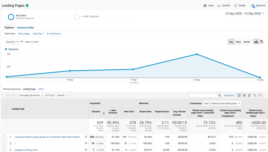
As with the All Pages report, you can track metrics like bounce rate, pages per session and average session duration.
However it also shows you conversion data if you have goal tracking set up.
Again, this report will give you a good overview of areas that need closer investigation.
And it’s a good starting point before you go ahead and check your landing pages against the criteria in the following checklist:
- Have a compelling headline that matches the messaging on any ads that are sending traffic to it
- Make sure you include crystal clear call to action buttons, but don’t have too many of them. You want to keep the page focused
- Use bullet points to outline the benefits of your offer as well as the features
- Keep the page as uncluttered as you can by removing unnecessary navigation, and try to minimise distractions. If you only want your prospect to do one thing, you need to make sure the page design accomplishes this
- Include a short, simple email capture form. Consider whether you need their name as well as their email address?
- Having customer testimonials and/or reviews on the page can do a fantastic job of adding credibility to your offering. Make sure they are authentic, and include full name, occupation, and photo if you can
- Run A/B tests on different headlines, calls to action, images, and testimonials to see what drives the highest conversion rates.
Area 4: The checkout process
If you have an ecommerce website, then your most valuable pages are going to be the ones that make up your checkout funnel, also known as a conversion funnel.
So you want to be sure that your potential customers complete their purchase, and don’t abandon your site before they do.
This is easier said than done though.
According to Conversion Sciences
“The average shopping cart abandonment rate currently stands at nearly 70%. That means 7 out of 10 highly qualified leads – people who like your product enough to click “Add to cart” – are being lost during the checkout process for one reason or another.”
So what can you do to give yourself the best chance of clinching the sale?
Back to Google Analytics.
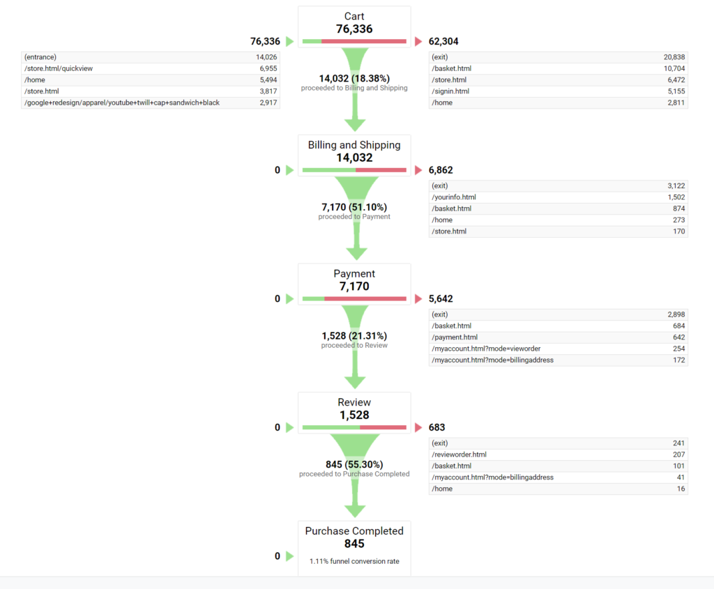
The Funnel Visualisation Report gives a visual representation of how visitors behave in your conversion funnel.
To access it, navigate to Conversions > Goals > Funnel Visualisation.
The report shows you how many visitors proceeded through each step of the funnel, as well as the abandonment rate.
This will show you where there are any glaring issues that you can investigate further.
Once you’ve done this, it’s a good idea to check that you’re also following these best practice tips in your checkout funnel.
1. Provide a guest checkout
Forcing your visitors to register with you when they start the checkout process is a sure-fire way to kill your conversion rates.
Allow them to check out as a guest, and you’ll see fewer drop-offs and more sales.
2. Keep the process as short as possible
It almost goes without saying that the longer the checkout process, the less likely it is that potential customers will complete it.
But you’d be amazed how unnecessarily long and complex some checkout funnels are.
Make sure you’re only asking for critical information in your forms. You can always go back and get more data after you’ve secured the sale.
3. Show total order cost up front
Does this sound familiar? You’re on a website and you’re about to pay for the product that’s in your shopping cart. You’re happy with the price, but then when you click through to the payment page, the price has gone up!
This is because additional costs (usually shipping) weren’t included up front.
Don’t annoy your customers by not showing the total order cost on the product page. It’s a small thing, but it can make a big difference.
4. Include trust factors like payment company logos and padlocks
Humans are suspicious creatures, and with the levels of online fraud activity these days, we are probably right to be.
Include trust signals on your payment pages like the logos of the payment companies (Visa, Mastercard) you use to process your payments, and security icons (padlocks, company logos).
These can reduce your visitors’ fears and increase trust in your brand.
5. Have a water-tight returns policy
You should always have a returns policy as it can very effectively remove any barriers to your visitors buying from you.
Just make sure it’s clearly visible on your checkout page(s).
A returns policy can speak volumes to potential customers about the perceived quality of your product, and about how fairly you treat customers once they have bought from you.
Conclusion
You’ve done the hard work of getting a visitor to your website. Now you want them to buy your product or service.
So you need to be sure you are making it as easy as possible for them to do it.
There are too many companies whose websites do a poor job of converting their visitors into customers.
After all, only 30% of website visitors who add a product to their shopping cart actually go on and buy it.
Make sure yours isn’t one of them.
By following these proven conversion rate optimisation tips and techniques, you stand a great chance of slashing your cart abandonment rates, boosting your site’s conversion rates and turbo-charging your sales.
Have you tried any tactics that have helped you boost your website’s conversion rates? Let me know in the comments below!
Subscribe to the series and get alerted when a new post is published.

No Responses