
In this first feature post in the series, I show you how and why you should run a regular digital competitor analysis.
What is a digital competitor analysis?
A digital competitor analysis is a study of your direct and indirect competitors’ websites and other digital channels.
HubSpot defines it as:
“A strategy where you identify major competitors and research their products, sales, and marketing strategies.”
Why should you do it?
Carrying out a competitor analysis is a great way to benchmark how your website is performing against others in its field.
It’s also a good way of checking if there are areas you are missing out on in your digital marketing efforts.
It forces you to familiarise yourself with what your rivals in business are doing, and to carry out research on their products, their sales and their marketing strategies.
Analysing your competition in this way gives you a clear view of what they are doing well, and what not so well.
By identifying these areas of weakness, and then capitalising on them on your own site, you can get a step up on them.
When should you do it?
It’s a good idea to carry out a competitor analysis at least a couple of times a year.
The landscape is constantly in flux, and companies are always diversifying their product offering, so it pays to keep alert to developments in your market. You want to be aware of any changes your competitors are making so you can stay ahead of the game.
You should always run one just before you carry out any major redesign or large-scale addition to your site.
Who should do it?
You could get someone to do the job for you – you can hire digital marketers or UX consultants on sites like Upwork and Fiverr even if you’ve not got a huge budget.
But if you know what you’re looking for (and I’m going to show you exactly that here) then you should be able to do the job yourself.
Get the free guide:
9 common website conversion killers – and how to fix them
Download it here.
What should you do?
Step 1: Select the most relevant companies to include in your competitor analysis
These should be ones that are currently your direct competitors, although it’s also worth considering indirect competitors too. These might be companies that sell slightly different types of products, but target the same group of customers as you.
It’s worth articulating up front what the list of competitors you’re including in the competitor analysis have in common. Slick, premium sites, for example; or high-quality modern photography.
Step 2: Decide how you’re going to measure success
You need to determine which areas you’re going to focus on in your competitor analysis. These tend to vary by industry, but for an ecommerce business you might choose:
- Homepage effectiveness
- Product quality and positioning (including pricing, distribution)
- How easy it is to use the shopping basket/checkout
- How well they capture email data
while for a car insurance company, for instance, you may want to look at:
- Clarity of information (e.g. what the policy actually covers you for)
- How easy the application form is to complete
- Cross-sell and upsell effectiveness
- Claims information
There are also some rather more standard ones that are relevant across the board, like quality of images, effectiveness of social media and mobile-friendliness (that is, how good the site looks and functions on a phone).
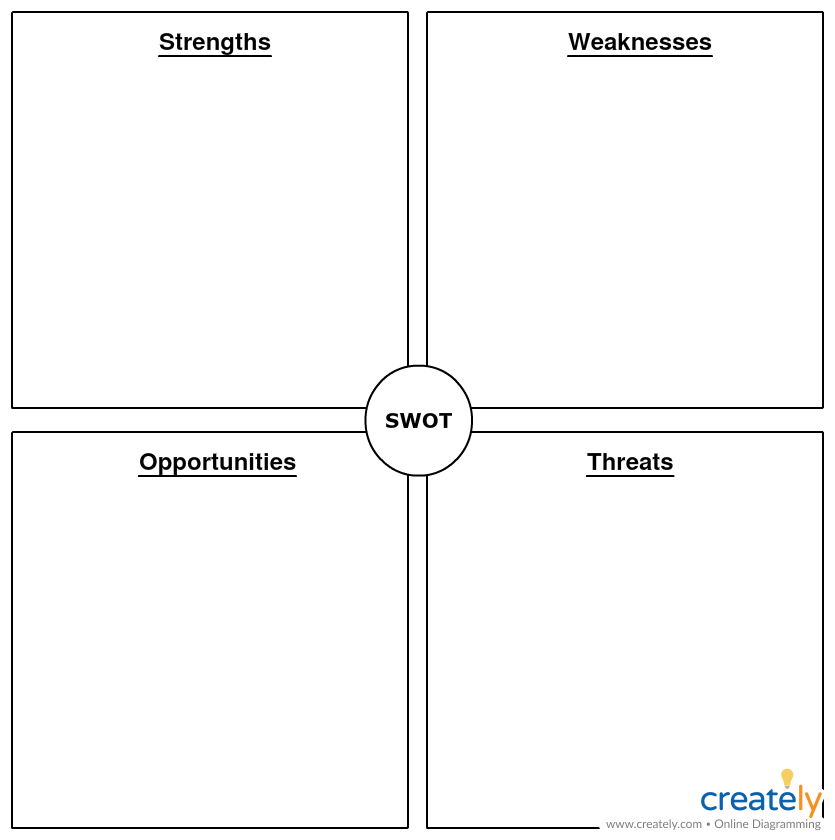
Step 3: Run a SWOT analysis to understand your competitors’ strengths, weaknesses, opportunities and threats.
You can use a simple matrix like this one from Creately:
Or you may find it easier to design one like this, where you can list the findings by company, one below the other:
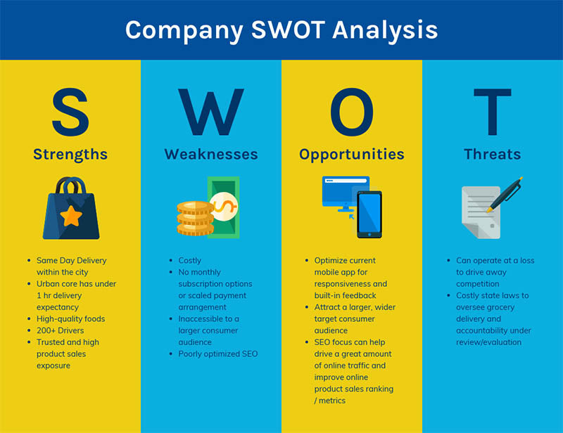
This can be a really effective way of documenting your findings.
It focuses your attention on where the competitor is doing well, where they are not doing so well, where there are opportunities for you to steal a march on them, and finally areas where they pose a threat to you.
All you need to do is apply each of the 4 criteria in the SWOT analysis to the areas you decided to measure in Step 2, and there you have it – your framework for analysing your competitors!
Let’s apply it to the example I mentioned above – the ecommerce website.
In this instance I’m going to pretend I’m an online jeweler, and I’ve run a competitor analysis on some competing companies’ websites.
The competitor analysis in action
I started off by selecting the companies I was going to include in my competitor analysis.
One way of doing this is by following these two steps:
- Choose companies whose websites compete for the same or similar product or category search terms in the search engines.
- Review other high ranking sites in the luxury jewellery market.
This then gives me a good range of direct and indirect competitor websites that I can be confident offer similar products.
So I ended up with a list like this:
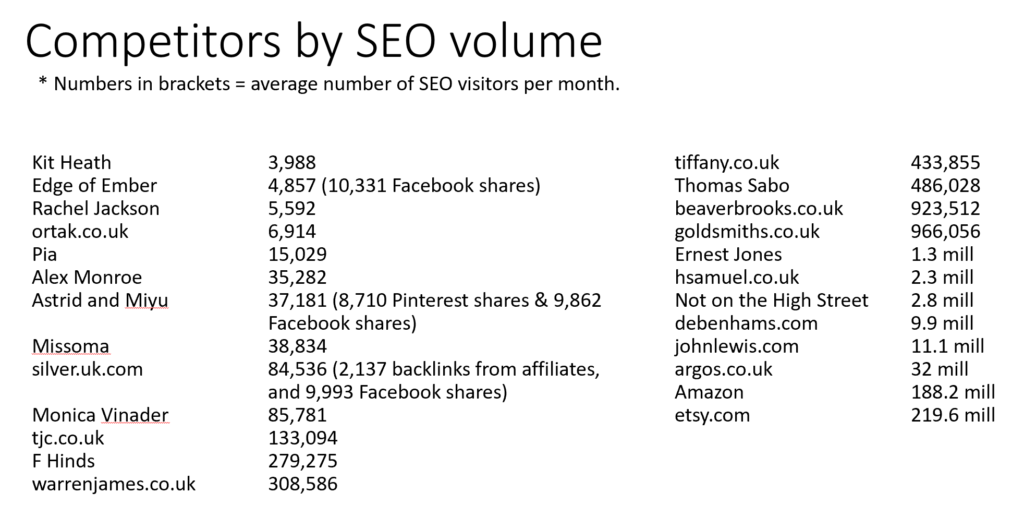
The list on the left is direct competitors who are similar companies to mine (generally small online jewellery brands) with the average number of monthly visitors to their sites from SEO beside them.
The list on the right is indirect competitors – they are sites that rank highly for similar keywords in organic search, but tend to be larger high street retailers, or ones that sell jewellery as only one of their offerings.
I then tend to hone these down to a short list of about 5 or 6.
Element 1: Homepage effectiveness
The first thing I did was a review of the selected companies’ homepages, based on a set of predefined criteria. This took the form of a usability, or heuristic, review.
These criteria were:
- Clarity and ease of navigation
- Brand experience
- Quality of photography
- Clarity of design and content
- Mobile experience
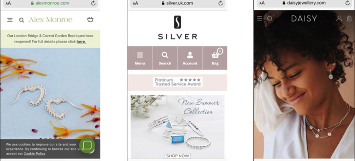
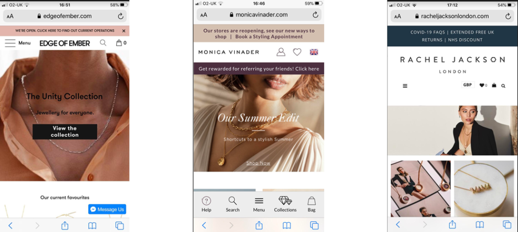
This homepage scored well for clarity of navigation and quality of photography, but not quite so well for design clarity…
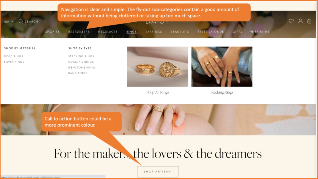
…while this one scored well for mobile experience – stylish product shot above the fold, but also important information clearly laid out, without being cluttered.
If you wanted to get really forensic you could use a scoring matrix for each of the criteria, and give scores of 0-5 for each company.
Element 2: Product quality and positioning
Next I wanted to explore:
- The quality of the products and services that my competitors are offering compared to mine
- How they are positioning themselves in the market (high-end/premium, price-led)
- Whether they have different pricing strategies for offline and online; and
- What their distribution strategy is (do they offer free shipping, for example)
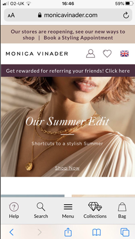
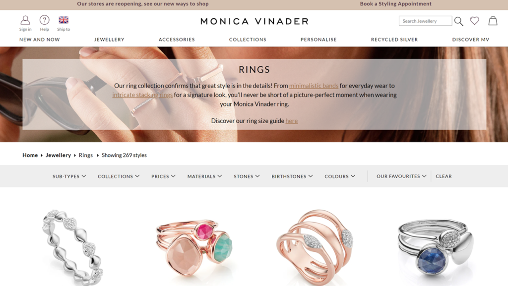
Monica Vinader’s understated yet simple design and beautiful product shots are perfect for a high-end brand selling premium products.
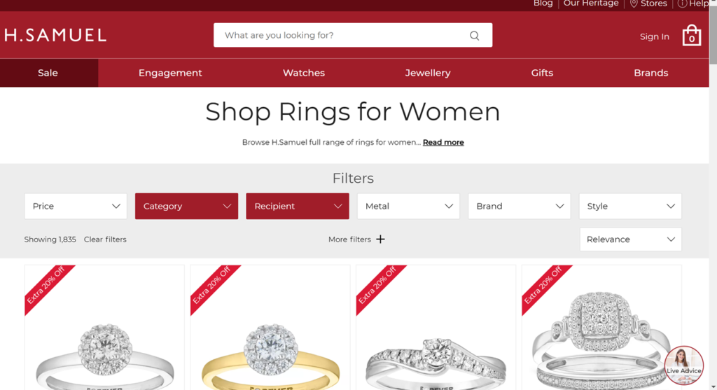
While a High Street brand like H Samuel has more of a price-led approach, which is reflected in its design and layout…
It’s also a good idea to look at the different channels your competitors are using to sell their products. Are they selling on partner sites, for instance, like Amazon?
This competitor has a Facebook shop. When visitors click on a product they are sent straight to the buying page on the website. It can be a great way to increase the reach of your product offering.
Element 3: How easy it is to use the shopping basket/checkout
It’s worth also looking at the sales process for each of the competitor websites. That is, the route a visitor would take from selecting a product all the way through to buying it on the site.
So usually this would be:
Product details page > Shopping Cart > Delivery and billing details > Payment & confirmation.
Naturally it’s going to be tricky going through this whole process as you won’t want to buy a product each time.
However you can get a good idea of everything up until the payment page without having to put your card details in.
Good questions to ask are:
- How easy is it to add products to the shopping cart?
- Is it clear what you need to do when you’re in the cart?
- How easy it is to find out whether the product is in stock?
- Are the checkout instructions clear?
- Are you forced to register/log in before buying?
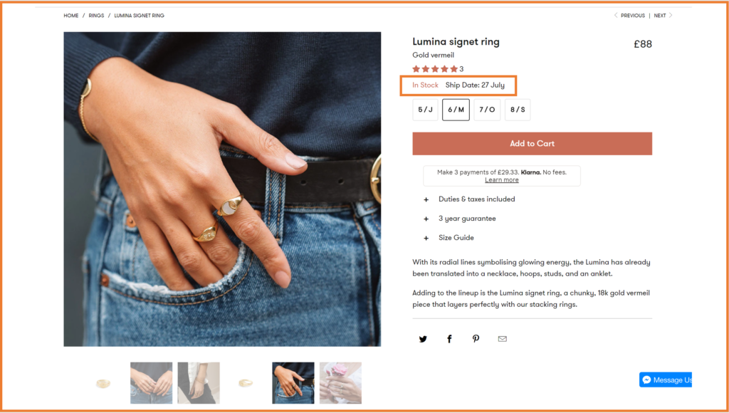
Edge of Ember has a really clear Add to Cart call to action button on its product details page, as well as neatly ordered size, stock and shipping information. They even give a summary of product features and benefits as a reminder.
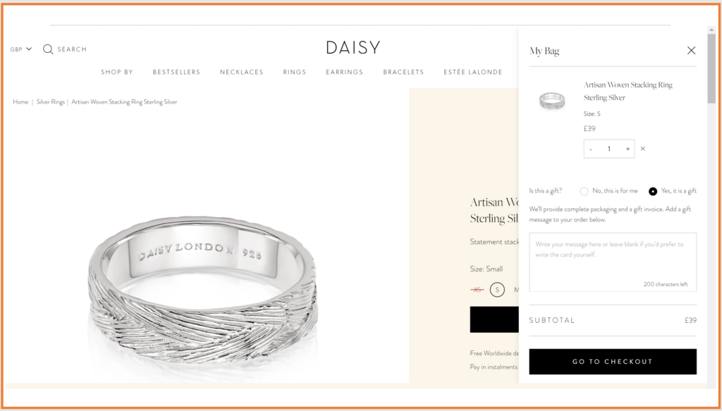
Daisy London uses a simple uncluttered layout for its cart (or ‘bag’ as they call it), but manages to include plenty of salient information like size and product shot, as well as clear instructions for adding a gift message.
They also have a clear, full-width Go to Checkout button at the bottom of the panel, to make it crystal clear what you need to do next.
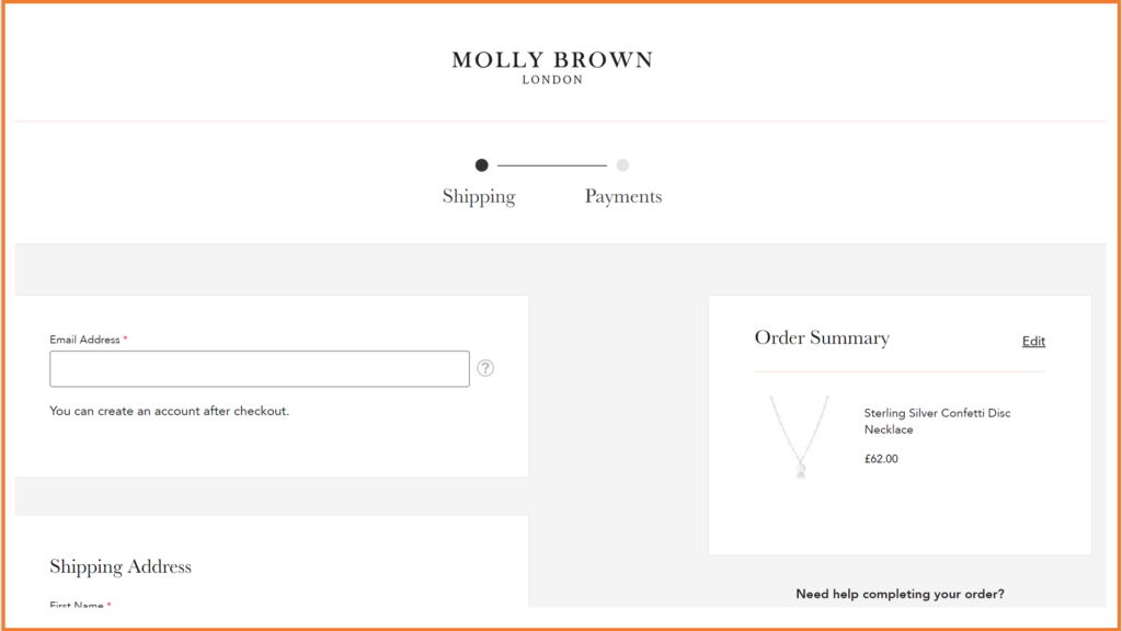
What’s good about Molly Brown London is that they allow you to create your account after you’ve checked out, rather than forcing you to register before buying.
Not having a guest checkout can be a big conversion killer.
As far as the checkout itself is concerned, I’d recommend looking at things like:
- How many different payment options are available
- Whether there are trust signals visible on the page
- How simple the payment process is
- Whether the page is free of distractions
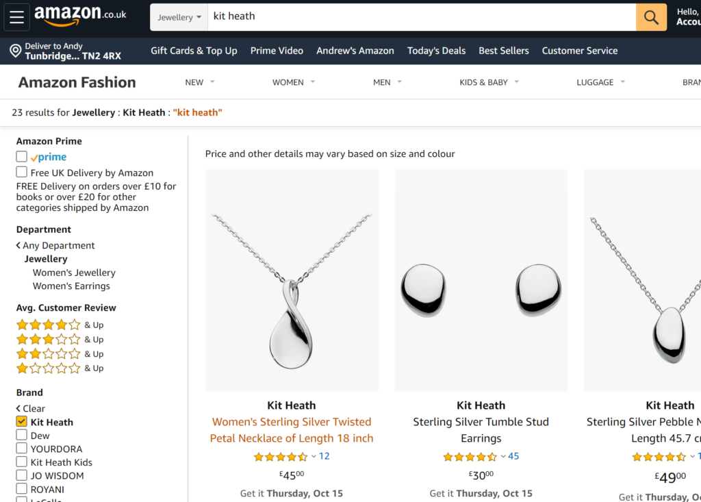
Kit Heath does it pretty well on the whole. They clearly lay out the steps in the payment process, from billing information through to reviewing your order.
And they also show the SagePay logo with padlock in a prominent place on the top right of the screen.
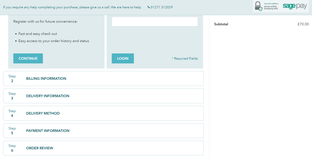
There is no other navigation on the page, which means it’s less likely visitors will be distracted and leave the site at this point.
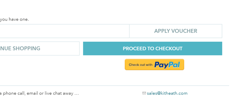
They also offer PayPal as an alternative payment option:
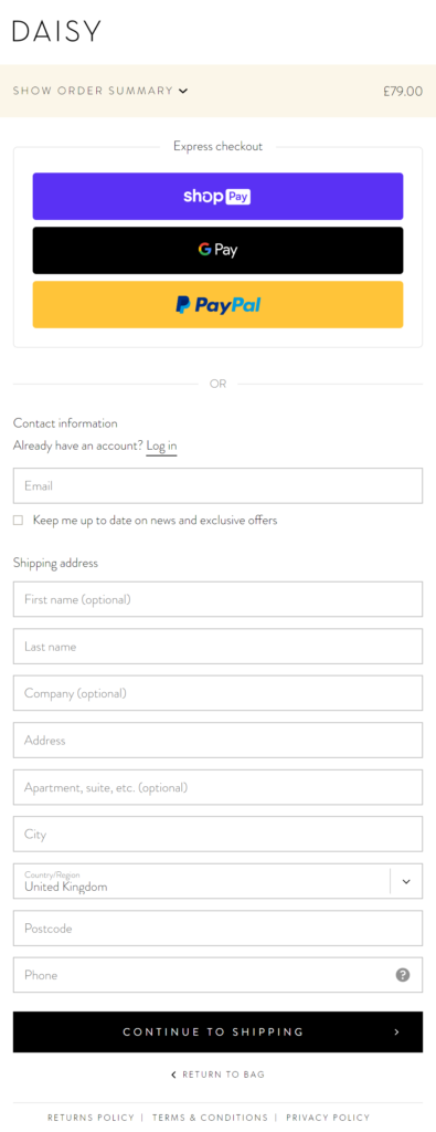
Daisy London gives you the option of paying by express checkout if you don’t want to pay by card – although it isn’t totally obvious what happens after you’ve completed your shipping address details on the form.
The card payment and billing details form has a nice, simple layout. It looks very professional, while the card logos and padlock icon are good trust signals.
Get the free guide:
9 common website conversion killers – and how to fix them
Download it here.
Element 4: How well they capture email data
When a group of successful business owners was asked what their most valuable asset is, they all said that it’s their email list.
That’s because subscribers on an email list have already pre-qualified themselves as being interested in what the company has to offer. And as a result they are more likely to buy the company’s products and services.
For this reason it’s critically important to attract quality leads with an email opt-in offer – and that’s why I tend to include it in my competitor analysis.
There are four things I look out for when I review a website’s email data capture:
- How visible is the opt-in form?
- Do they incentivise the sign-up with a value-led offer?
- How quick and easy is it to sign up?
- To what extent are data privacy, cookies, considered?
A number of the sites position the sign-up form at the bottom of the page, telling visitors what they are going to get in their communication.
The fact that it’s so far down the page means it’s easy to miss. Kit Heath and Molly Brown are cases in point:
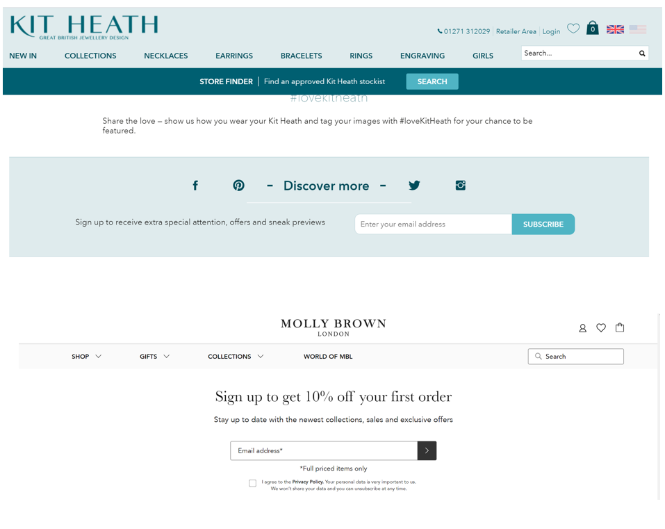
Kit Heath does also have a pop-up that appears after a timed delay. While some people find this obtrusive, it can work well in increasing subscription rates.
They don’t offer a specific incentive, but you do get the feeling that you’re going to benefit from special offers by signing up. And the call to action is very clear.
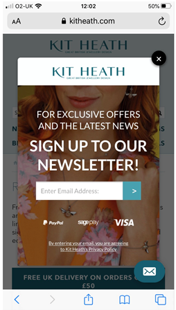
To build trust they have included a link to their privacy policy, and it’s very easy to sign up. All you have to do is enter your email address.
A few of the sites offer 10% off your first order.
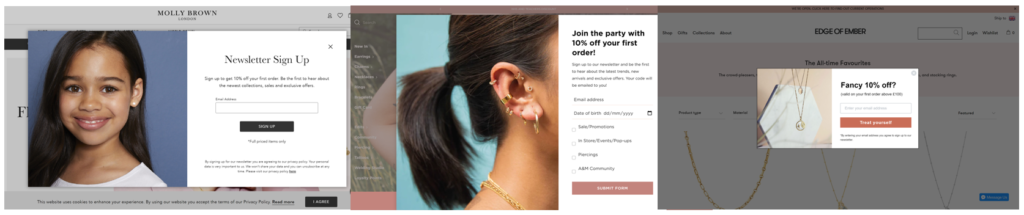
Having a very specific offer like this can be a good hook. But not differentiating can be risky as it means your offer doesn’t stand out from the crowd.
This creates a good opportunity for me to offer something a bit different on my website – a free gift, for instance.
Other considerations
There are also some more standard areas you should focus on as part of your competitor analysis. These include:
- Quality of photography
- Mobile-friendliness
- Effectiveness of social media
Quality of photography
The nature of the product here means that high quality design and imagery on the websites is pretty much a given.
These ring images on Monica Vinader, for instance, are beautifully shot – evoking a real sense of quality and luxury.

While the lifestyle shot on the Soru homepage is reminiscent of a high-end fashion magazine.

Mobile-friendliness
According to Statista, more than 50% of website visits are now made on a mobile phone. So it’s critical that a visitor’s experience of a brand is just as good on mobile as it is on a desktop or laptop.
In terms of how the sites perform on mobile phones, I tend to look out for the following:
- Firstly, whether the site is optimised for mobile
- Whether it’s easy to see what the website offers without having to scroll
- How easy it is to buy on the site
- How fast the site loads
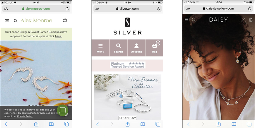
The sites I’ve included in my analysis are all optimised for mobile, and it’s generally clear at first glance what it is they sell.
They tend to all lead with a mixture of bold product shots and lifestyle modeling shots, with very little copy.
Some of the calls to action are more prominent on some sites (Silver, Edge of Ember). This results in a slightly more direct buying journey on these two sites than on the others.
Another crucial criterion – particularly in Google’s eyes – is how fast the sites load on a mobile phone.
I ran the sites through the Google Page Speed Insights tool to check page load speeds. All of the sites performed poorly on mobile, mainly because of the large images that hadn’t been optimised. In fact, none of the sites scored higher than 27 out of 100, which is really quite poor.
This gives me another great opportunity to gain an advantage on these competitors by optimising the images for mobile on my website.
The page speed insights tool shows you exactly what to do to minimise page load speeds, and all you would need to do is hand them over to your developer to fix.
Social media effectiveness
The final area I investigated was social media – specifically how well the competitors are using social media to engage with their audience and sell their product.
One or two of the sites are using social media very effectively.
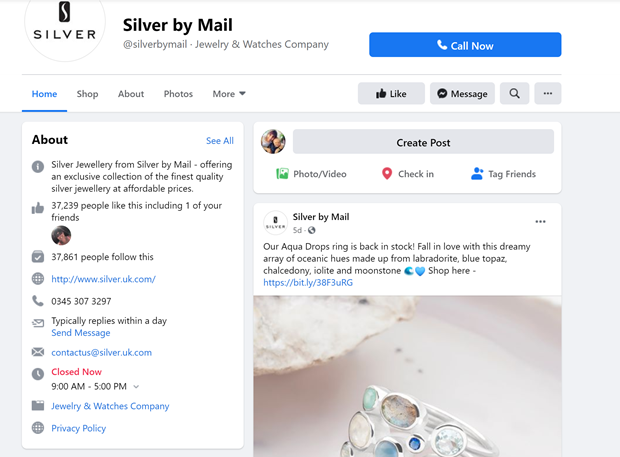
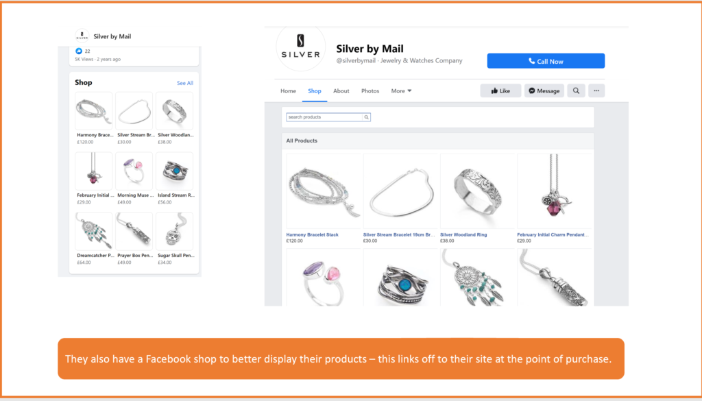
Silver by Mail is the number one site in Google for silver jewellery.
Their position is greatly helped by their social media. On Facebook they have:
- 37,861 followers
- An average of 9,993 shares per month
and they post once a week with good photos.
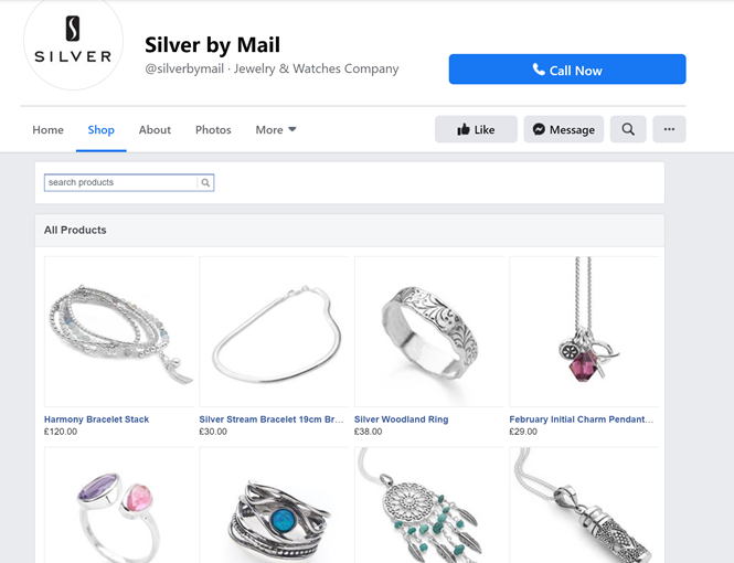
They also have a Facebook shop to better display their products. This links off to their site at point of purchase:
Edge of Ember use carousel ads on Facebook to good effect:

as well as using professional video content. This video was created using a sequence of stills:

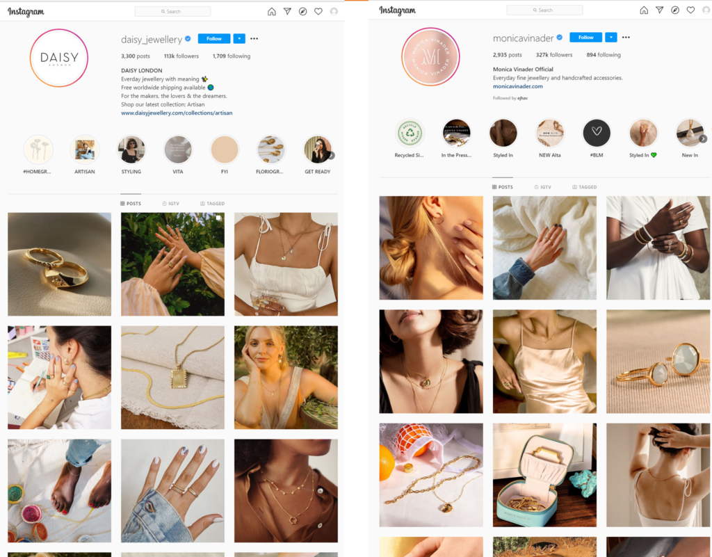
Daisy London and Monica Vinader both use Instagram story highlights to show off different areas of the business.
Conclusion
If you want to keep ahead of your competition, you need to keep on top of what they are doing. But with so many marketing channels available now, it’s nigh on impossible to do.
That’s why it’s so important to run a competitor analysis at least twice a year.
By following the steps in this post, you can get an in-depth insight into your competition’s digital marketing activities, identify where there are gaps you can exploit, and then put your plan into action.
Have you tried running your own digital competitor analysis? Did it give you useful insights? Let me know in the comments below the post.
In the next post in this series I show you the steps you can take to make sure your website is doing the best job of attracting quality visitors.


No Responses